
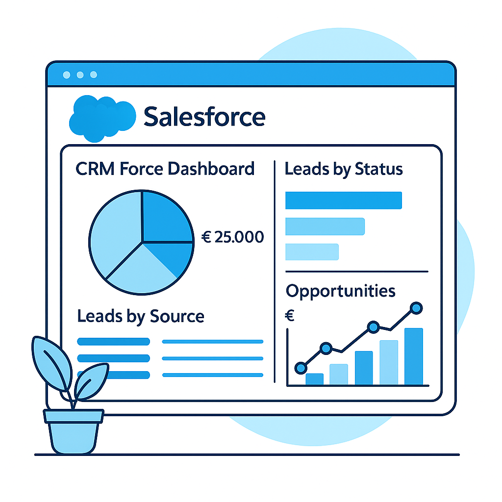
The Power of Reports and Dashboards in Salesforce
From data to insight with powerful visualizations. Discover how reports and dashboards help you grip your KPIs.
Working on process automation? Also read: Automating with Salesforce Flow. Working with multiple systems? Check out: Collaboration & Integrations.
What Is a Report?
A filtered, grouped data overview with totals and formulas. Perfect for analysis and drilling down into details.
What Is a Dashboard?
A visual collection of components (tiles, charts, tables) showing your KPIs at a glance.
Why Is This Important?
See in real-time if you're on track, less manual work and decide based on facts instead of gut feeling.
1. What Do We Mean by Reports & Dashboards?
Reports and dashboards are closely related, but serve different purposes. Reports deliver the details and calculations; dashboards make the outcome directly actionable.
Think of a cockpit: the report is the measuring instrument under the hood, the dashboard is your control console with gauges and traffic lights.
Did You Know…
Salesforce in Lightning supports dozens of component variants, so you can choose the best visual for each KPI?

2. Why Are They Important for Your Organization?
Case
A sales manager wants to know daily how the team is performing, but only gets Excel overviews that are weeks old. Result: steering on gut feeling and lots of manual work.
- Faster insight: current KPIs without exporting.
- Less manual work: one source, reusable reports.
- Real-time KPIs: targets, trends and alerts in one screen.
"With a good dashboard you can see within 10 seconds if you're on track."
3. The Building Blocks of Reports and Dashboards
Reports
Choose a report type, filter and group. Add summary formulas for KPIs.
Dashboard Components
KPI tiles, charts and tables. Each component is linked to one report.
Filters
Report filters limit data; dashboard filters let users switch dynamically.
Lightning Experience
Visual building: drag, scale, immediate results with responsive layouts.

4. Practical Example: From Data to Dashboard
Scenario: the Sales Manager wants to see daily current revenue vs. target, per region.
Create the Report
- Reports → New → "Opportunities".
- Filters: Stage = Closed Won; Close Date = Current Quarter.
- Group by Region and show SUM(Amount).
- Optional: formula "% of target".
Build the Components
- KPI tile "Total Revenue QTD".
- Bar chart "Revenue per region (QTD)".
- Line chart "Revenue per week (trend)".
Add Dashboard Filters
- Filter on Region.
- Optional: Team or Opportunity Owner.
Share with Your Team
- Folder "Sales Management" with Viewer permissions.
- Add as tab or pin as favorite.
5. Best Practices & Tips
✅ Do's
- Use consistent definitions and measurement moments.
- Give clear names: "Service SLA — Month — NL".
- Limit to 6–8 powerful components per dashboard.
- Schedule monthly reviews with stakeholders.
🚫 Don'ts
- Duplicate KPIs per person; use filters.
- Keep targets outside Salesforce.
- Keep creating variants without governance.
Common Mistakes
- Overcrowded dashboards: core KPIs get buried.
- Different definitions per team: numbers not comparable.
- Targets missing in Salesforce: progress against goal is invisible.
6. Common Scenarios
Sales Pipeline
Stages, expected revenue, win ratio and cycle times.
Service Performance
SLA, first-call resolution, resolution time and backlog.
Marketing
Leads, MQLs, conversion to opportunity and ROI.
C-level KPIs
Revenue, margin, churn/retention, NPS/CSAT and forecast.
Want better insights with reports and dashboards?
We help you define KPIs, set up dashboards and structure reports so your team can make data-driven decisions.